
When I read a book I have the habit of highlighting certain passages I find interesting or useful. After I finish the book I’ll type up those passages and put them into a note on my phone. I’ll keep them to comb through every so often so that I remember what that certain book was about. That’s what these are. So if I ever end up lending you a book, these are the sections that I’ve highlighted in that book. Enjoy!
Studies of road signs typically find that iconic signs can be read at twice the distance and in half the time as word signs.
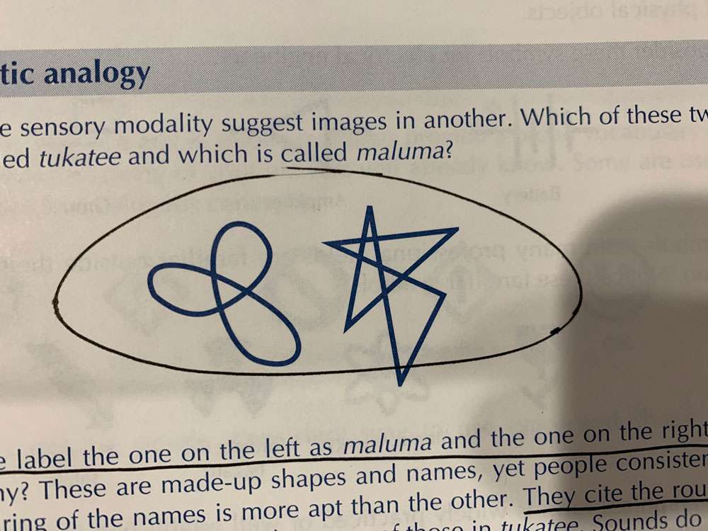
Graphics work better than words for representing subtle concepts of shape, color, position, angle, size, texture, and pattern.
Icons replace wide rectangles of text with compact squares of meaning.
To find a word label we must read each of the labels in turn; to find an icon we merely scan for its distinctive shape.
When we encounter a visual symbol, we give it a name and remember that name along with the visual image. Thus icons are stored as visual and verbal memories, but word labels are retained only verbally.
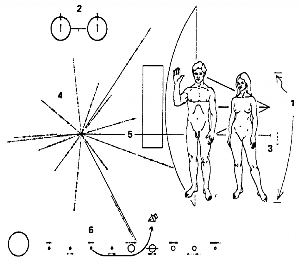
The first serious attempt to communicate with beings outside our solar system came when designers of the Pioneer 10 space probe attached a plaque using visual symbols to tell an intelligent being encountering the spacecraft where the probe came from and who sent it. It did so by using visual images of the few concepts and experiences an extraterrestrial being is likely to have in common with us: mathematics, physics, and basic chemistry.
Icons and words are not enemies. They are not mutually exclusive. Word labels help users learn visual initially, and the visual images help poor readers interpret word labels.
Icons do not make a product easier to use. Good design does.
Some concepts are inherently difficult to understand–whether we represent them with icons or with words. For such concepts, the issue is not whether icons require study but whether they require less or more study than equivalent word labels. An icon does not fail if it requires a few seconds of study the first time the user sees it. Provided users are not totally stumped by an icon, the process of figuring out its meaning adds an enjoyable challenge to learning the system. Watch users when they decode an icon. They smile. This process of decoding an icon actively engages the user and helps the user remember the icon so that recognition is almost instant the next time. This instant recognition may be much more important than the initial delay, especially if the user will encounter the icon dozens or even hundreds of times.
Icons are meant to be viewed entirely in a single glance and, once learned, recognized automatically.
Misunderstanding leads to bad design.
For icons to succeed, users must be able to do four things with them: decode, recognize, find, and activate. You may have to make tradeoffs among these four goals, but all are necessary to some extent.
Draw a simple image already associated with the concept you wish to represent. If you cannot do this, then represent the concept by combining familiar images in a simple way.
Once we’ve learned an icon, we merely have to recognize it when we see it and we have to recall its meaning. Recognition is especially quick and reliable when images are:
- Concrete, showing real-world objects
- Vivid, clearly depicted
- Conceptually distinct one from another
The image should awaken memories of related sounds, words, and emotions.
Ensure that users can predict the distinctive visual characteristics, such as shape and color, of the icon they seek. Do this by asking an user what they think the icon would be for a certain concept before showing them the one you designed.
Establish, teach, and consistently follow a simple scheme for activating icons. (Activating meaning clicking on or touching a button)
If you understand how icons work, you understand how graphics work; if you understand how graphics work, you understand how we communicate–regardless of medium.
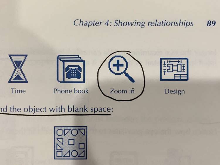
In regards to visual processing – We remember not just one visual image for the object but several. What we see comes not from the eyes but from memory. We see mostly what we already know and have seen before. Visual input seems designed more to trigger the correct memories than to tell us directly what something looks like. We tend to seek out details that confirm our current interpretation of a scene.
The icon is more like a catalyst that releases meaning in the presence of a context and a human mind.
Context includes adjacent icons.
Once you know what the object is, your memory can fill in all the necessary details. This would work well if you leave space in the middle of an icon for the user to fill in or for an object that has lots of variability in one part. Leave that section blank for an user to fill in with what they remember.
The message is what the icon is all about. If the user recognizes the icon as representing the concept you intended, the message was understood. There are two kinds of messages: factual and emotional. Factual messages represent specific information we want the user to recognize and perhaps experience. A choice of color or selection of an object can be a message, enabler, or noise.
Enablers
Enablers are not part of the message but they may be essential to speedy, reliable delivery of the message. If you leave out enablers, users can still get the same message, but it will take them longer and they will make more mistakes.
Noise
Noise is anything that interferes with the sure delivery of the right message. Anything that is not clearly an enabler or message is probably noise. Noise is relatively easy to detect.
How you can analyze test data
| If you take out the suspicious item and the happens… | The thing you removed was this… |
| Users get the intended message more quickly and more reliably | Noise |
| Users get the message, but take longer and make more mistakes | Enabler |
| Some users get the message, others do not | Redundant Message |
| No users get the message | Nonredundant Message |
Each symbol must have a strong, direct association with the desired meaning.
Start with symbols that show the subject itself or at least physically resemble it. These are easy to understand and recognize. Then consider ones that show a related object. These may take a little study and thought, but once understood, they are recognized reliably. If you cannot communicate The concept by showing a familiar object, only then consider more abstract symbologies.
Show the subject if you can. This is the most direct symbol and usually the best. The physical similarity between the real-world object and its graphic representation ensures that the subject is recognized reliably. Often when the symbols mimic the subject, we forget that they are symbols at all and treat them as if they were the object being discussed
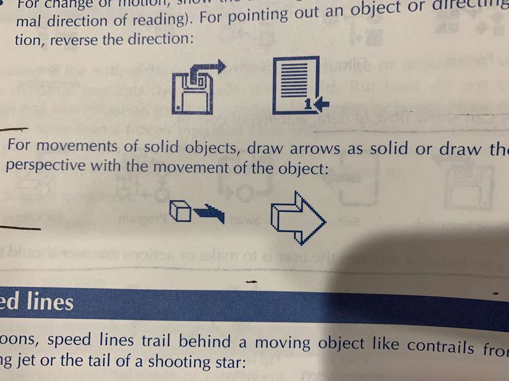
When an activity involves manipulating a physical object, show objects arranged the way they would appear to the user performing or observing the action.
If the action requires a person to assume a distinctive posture, we can use that posture to represent the action.
Sometimes it’s worth just searching through your emojis list to see if a common icon already exists.
When you can’t show the idea directly, you can show an analogous object, one with recognizable parallels to the real idea.
Icons for utility programs typically show an example of the problem the program is designed to overcome.
If an operation requires a familiar tool, you can use the tool as a symbol for that activity, it must, however, be both familiar to the viewer and strongly associated with the activity.
Often the icons for this software employ images of the tool, person, or body part used in the past to perform the software’s functions.
Electronic publishing systems typically use scissors, paste, pencils, and push pins.
Even general concepts can be represented by specific, familiar tools.
If an activity is traditionally performed with a part of the body, you can show or feature that body part as a symbol for the activity.
Because we use each part of the body for many functions, body parts are seldom sufficient to unambiguously implicate one activity. They usually require labels or other objects to clarify the meaning.
Often the best way to communicate the function of a button or command is by showing its goal, effects, or consequences.
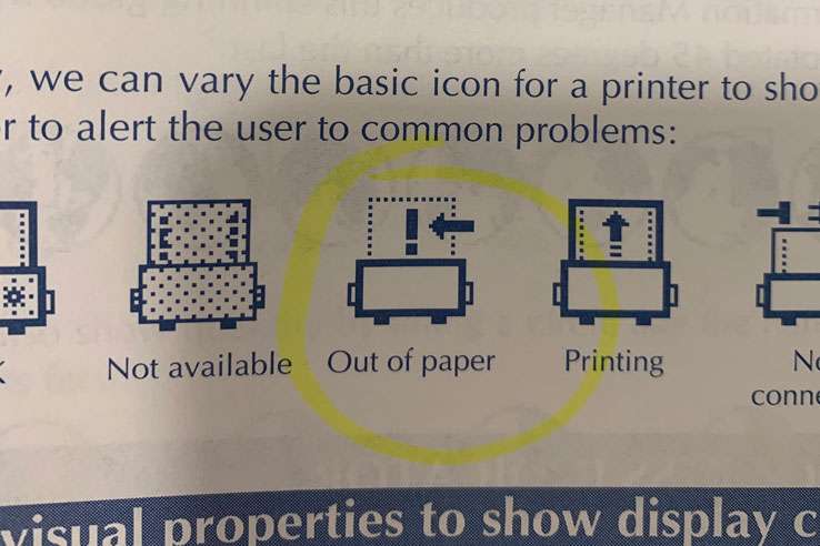
Many common symbols show the state or condition that will result from an action.
If the organization of the subject is important, you can often represent it by showing an object with a similar structure.
Synecdoche
In the figure of speech called synecdoche, we use a single, familiar part to stand for the whole object. This technique is widely used in road signs where a gas pump signifies a service station; a tent, an entire campground; a bed, a hotel; and a fork, knife, and spoon, a restaurant:
When the whole object is too complex or indistinct to represent a concept, pick a small, recognizable part.
When you cannot find a direct symbol for a concept, consider whether you can show it by the negation of its opposite, as in the figure of speech called litotes. We do this verbally when we show our approval by calling something “not bad.”
Broken arrow is a symbol for peace.
How do you show freedom? One way is to show release from its opposite, that is, imprisonment. Show an object used to block, thwart, or defend against the concept
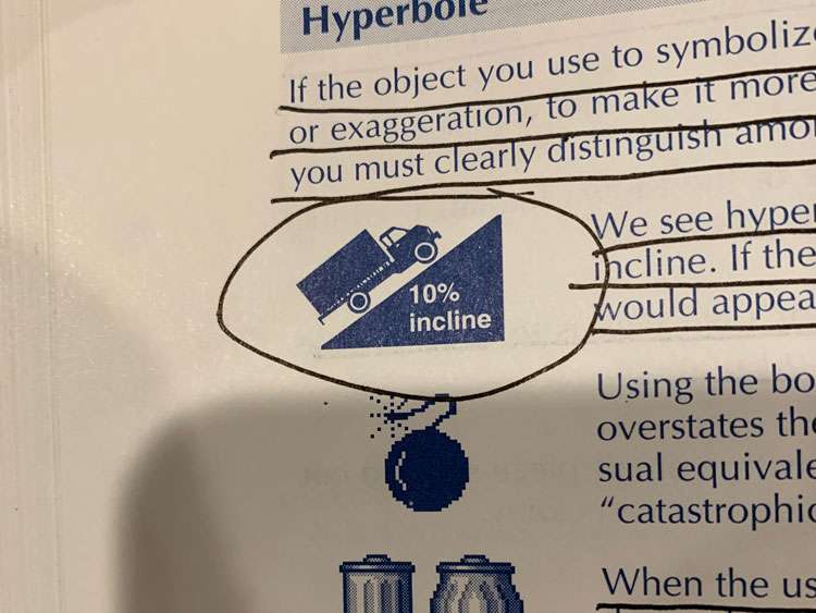
If the object you use to symbolize a concept is small, you may use hyperbole, or exaggeration, To make It more prominent. This technique is valuable when you must clearly distinguish among otherwise similar objects or concepts.
When the user of a Macintosh drops the icon for a file into the trash can icon, the sides of the trash can seem to bulge
Unless your improvement is vast and obvious, it will confuse readers and probably be rejected by those comfortable with the familiar form.
For a visual symbol show not what something actually looks like but what users think or remember it looks like. Often this an earlier, simpler version.
Similarly, in icons depicting before-and-after conditions, the after condition is to the right
Anything pointing to the right implies motion. When we do not want to imply motion or change, we typically point to the left.
A point seldom has any meaning on its own. Instead, it relates to some other object in the icon.
In icons we use lines to represent:
- Directions of force and action
- Barriers or limits to action or movement
- Paths of change or motion
- Discontinuities in texture orientation color or value within an object
- Guides to the eye
- Connections between objects
- Objects that stand in high contrast to their background appear powerful and important. This is why we draw ghost images and imaginary lines in lower contrast than primary edges and shapes.
- Viewers can readily distinguish about four different sizes in an icon, provided each is at least 30 percent larger than the previous.
- Brighter colors appear more powerful and important
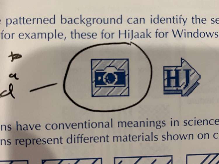
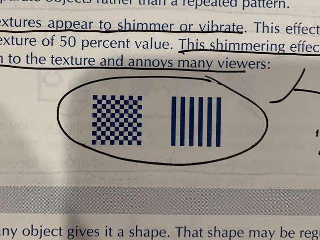
Regular patterns suggest uniformity and order, while irregular patterns suggest coarseness, crudeness, vulgarity, turmoil, and violence.
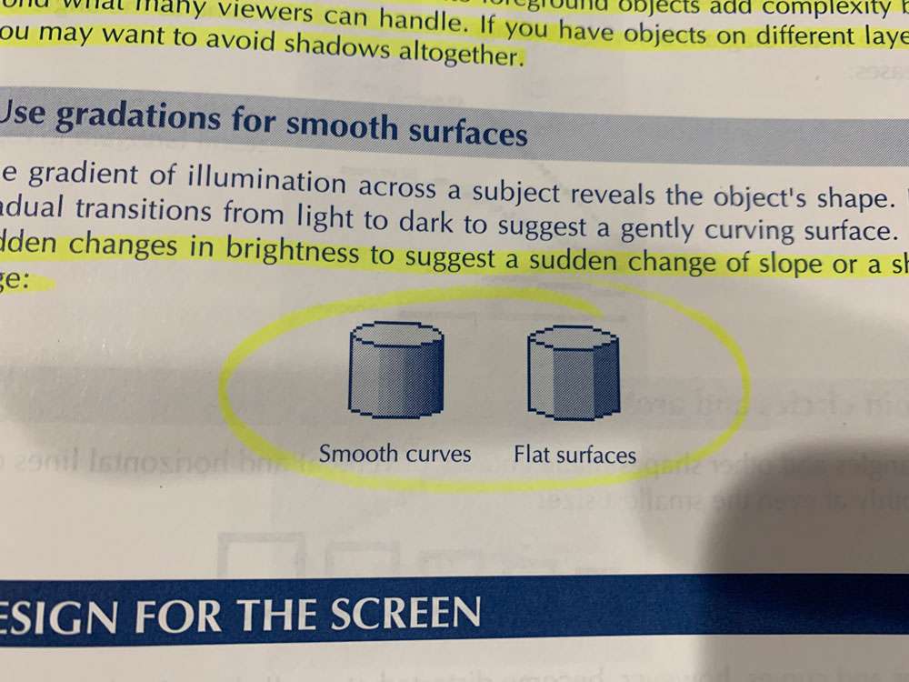
A sudden change of texture can indicate an edge, a fold, or a crease within an object.
In drawing, a gradual change of texture indicates changes in the angle of the surface relative to the source of light or to the viewer.
Straight-edged shapes occur most frequently in man-made objects.
Rounded shapes occur in nature and living organisms. We associate them with organic, fluid concepts.
Irregular shapes call attention to themselves. They may appear spontaneous and unplanned. They may be used to represent objects that are unique or are exceptions to the rule.
Concave shapes draw the eye into the enclosed space, focusing attention on whatever resides there.
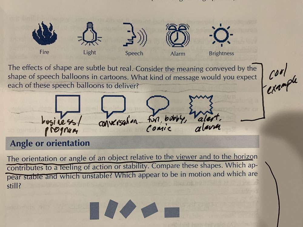
Keep in mind that the orientation or angle of an object relative to the viewer and to the horizon contributes to a feeling of action or stability. The more the orientation of an object or text differs from its most common form, the more slowly and less accurately we recognize it.
Dynamics are helpful to:
- Represent dynamic concepts such as change and motion. Any static icon that does this with arrows or multiple views is a candidate for animation.
- Focus attention on a single icon or object. In a basically static display, the eye is reliably drawn to any moving, blinking, or changing object.
For a single blinking rate use 3 Hz. For two rates use 2 Hz and 5 Hz and use no more than two blinking rates.
If the rate is too slow, the motions will seem unconnected. If it is too fast, the eye cannot form the separate images and the object will seem to blur rather than vibrate.
Straight movement suggests control and constraint. Motion along a curve has a more natural, fluid quality. Steady movement can seem mechanical and may suggest that the object is not moving under its own power. Accelerating or decelerating movement makes the object seem to propel itself across the screen.
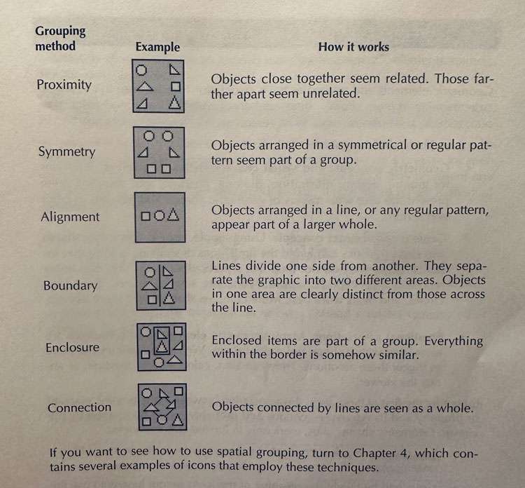
Often we need to say that two things are equal or similar, that they belong to the same category:
- Cluster the objects
- Just as lines can separate and divide, they can also join and unite objects.
- Box the objects
- Use similar graphical properties such as collie texture shape or orientation
- Arrange in a pattern
- Arranging objects along a line or in a grid
- Rules and lines can provide fences for the wandering eye, keeping it from inadvertently straying into unrelated information.
- Lines divide one side from another. Objects in one area are clearly distinct from those across the line.
- A line can also represent the act of dividing some other object as well as hiding an object
- Juxtapose opposites – One way to highlight differences is to place them side by side so that they are obvious in a single glance.
- Put directly different, contrasting images close together
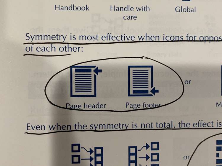
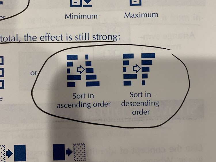
- For a more powerful icon, make two objects differ in more than one visual characteristic.
- Do not depend on small subtle differences, to fully distinguish objects, make them truly opposite
Showing Importance
- Urgency can be shown by blinking, but don’t expect viewers to be able to distinguish more than 2 or 3 different rates. Also, don’t expect them to attend to more than one moving or blinking object at a time.
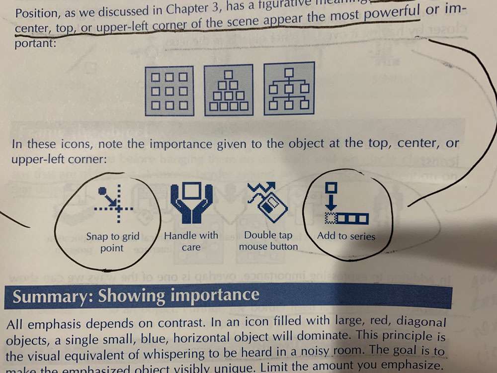
- Give the primary object the highest degree of contrast with its background.
- Enlarge the object
- You can surround the object with blank space
- In a design where verticals and horizontals predominate, a diagonal line will stand out.
- You can simply show an arrow or hand pointing to the object
- If the icon includes people, you can show them looking or pointing at the object
- We circle classified ads that are of interest. A box or border around an object focuses attention on that object. This is a difficult technique to use directly. The border itself is easily misinterpreted. One place where it does work well is where one object in the icon naturally encloses or encircles another.

Showing Depth
- Overlap involves more than one technique – blocking occurs when the lines of one object stop at the outline of another object
- Edges of obscured objects are omitted or conventionally drawn with dotted or dashed lines
- The lines of more distant objects do not actually touch the outlines of nearer objects
- Sometimes the nearer object is translucent and therefore does not completely block our view of the farther object. This works when you only have access to black and white.
- The color in the area of overlap is a blend of the color (or gray level) of both objects. The amount each object contributes to the overlap depends on the translucency of the top object. The more translucent it is, the more of the color of the overlapped object or background shows through.
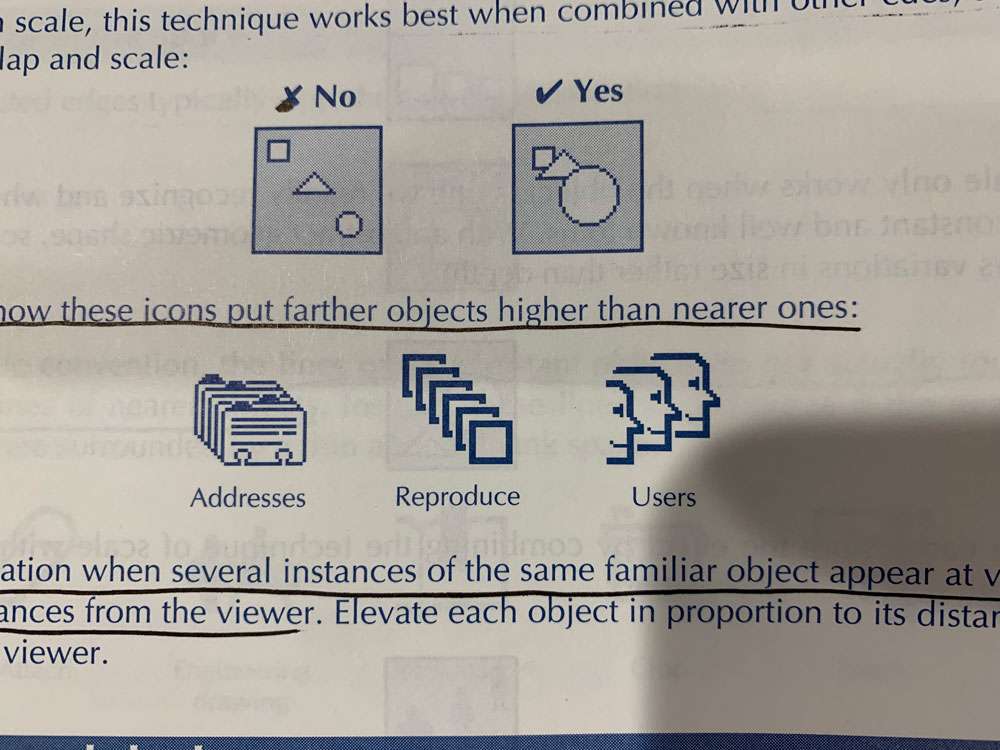
- Use scale when the scene contains several instances of a familiar object at various distances from the viewer
- Objects higher in our field of view normally appear farther away than those lower
- Use elevation when several instances of the same familiar object appear at various distances from the viewer.
- Shade and shadow – light reflected from a surface gives clues to its orientation and position relative to the light source
- By exposing the top and sides of a regular geometric solid, we create a strong impression of depth
- The mind perceives paler and bluer or grayer objects as more distant. Reds and oranges will seem to advance, while cooler colors like blues and greens will seem to recede.
There seem to be two causes for color perspective: One is the psychological association of aggression with warm colors and regression and calm with cool colors. Another is the physiological fact that different wavelengths of light are refracted to different degrees by the lenses of our eyes. These different colors come into focus at different planes and the eye cannot focus them at the same time. The mind concludes, incorrectly, that they come from objects at different distances. This three-dimensional effect of color is called chromostereopsis. It encourages us to use of intense warm colors for nearby objects and cooler, less saturated or darker colors for more distant objects:
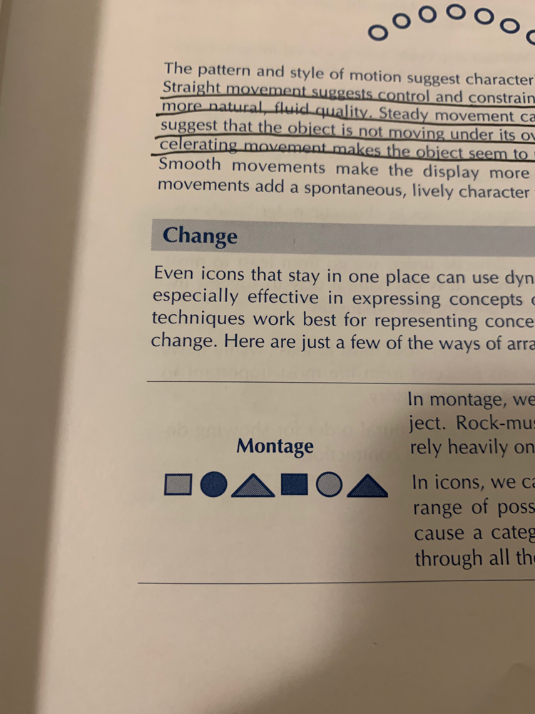
Showing Changes or Motion
- Arrows
- Arrows alone can show motion in a pure or abstract sense
- Arrows can be combined with an object to show a movement of that object
- Arrows can show the change from one state or condition to another
- Arrows can show flow of data
- They can indicate motions the user is to make or actions the user should take
- Arrows can direct the viewer’s gaze to a particular object
- Use shake lines to show vibration in an object, make invisible sound waves visible, suggest turmoil, turbulence, or agitation. To convey a nervous, stressful state.
- Ghost images – they are images trail behind an object to indicate it’s rapid movement. Use no more than three to five ghost images and make them progressively lighter and fainter as they proceed away from the object
- A simple version of this technique shows up in before-and-after icons. Sometimes, however, you have to reverse this convention. This occurs when drawings the “after” image as a solid would not sufficiently distinguish it from adjacent objects
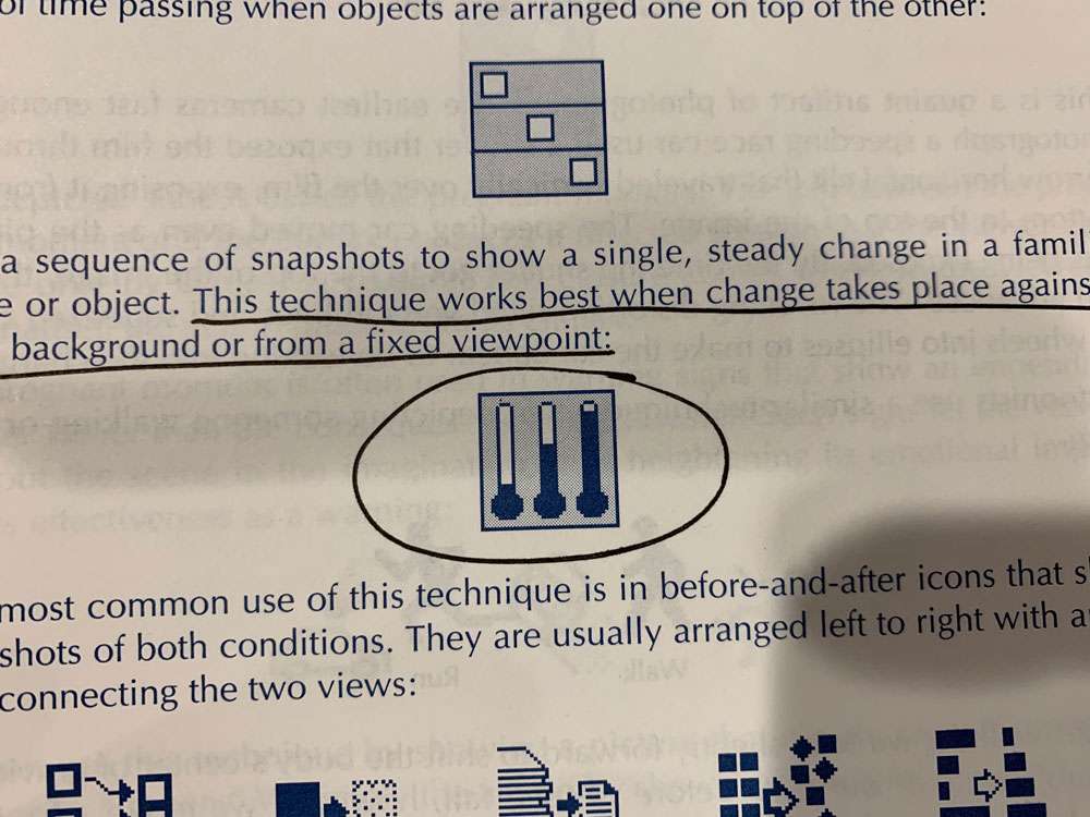
- Sequence of snapshots – A series of illustrations can show the object at the various stages of change. This technique works best when change takes place against a fixed background or from a fixed viewpoint.
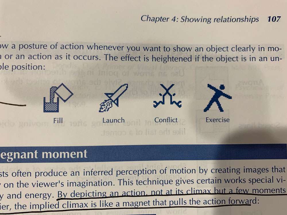
Pregnant moment – Depicting an action, not at its climax but a few moments earlier. The implied climax is like a magnet that pulls the action forward.
This depicted state is called the pregnant moment. The gap between the pregnant moment and the climax produces a directed tension that the viewer can relieve only by achieving closure. This closure comes when, in the viewer’s imagination, the action proceeds to its climax. The pregnant moment is often used in warning signs that show an impending disaster rather than the consequences of the disaster. Such signs let the viewer play out the scene in the imagination, thus heightening its emotional impact and its effectiveness as a warning:
Designing an Iconic Language
Every language has two parts: a vocabulary and a grammar. The vocabulary is the collection of elementary symbols that are combined according to the rules of the grammar to form units of expression. Grammar tells us what combinations have meaning and which do not.
Mathematics, as we said, is a language too. Its vocabulary consists of simple symbols for mathematical operations (+, -, =) The grammar of mathematics provides rules such as those you learned in algebra class.
The same principles apply to designing and using iconic languages – consistency and simplicity.
Large, complex systems benefit most from a simple, consistent iconic language.
Actions are what the user does to or with elements.
Objects are geometric figures being created and manipulated.
Methods specify how an action is carried out.
Change of State
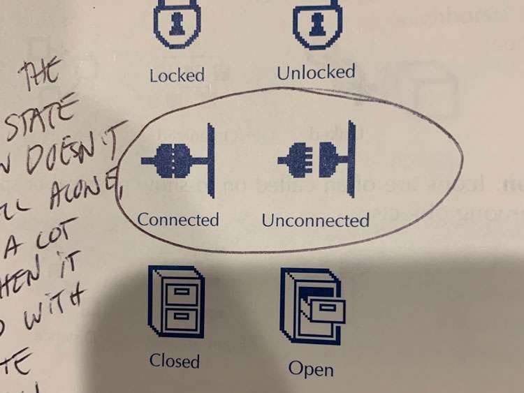
If the before state is well known, the image may show only the destination state.
Sometimes the opposite state of an icon doesn’t read well alone, but reads a lot better when it is toggled with its opposite frequently. (See below image)
Here’s how you might use an identifier – Imagine that you are designing icons for a program used to create multimedia presentations. You want to give your icons for the various media a thematic unity and you want to clearly associate them with your program and your company. You start with your company trademark. And you simply incorporate that emblem into the icons for the various media handled by your product.
In antithesis, we combine two sharply contrasting objects or characteristics to suggest a richer idea than is conveyed by either alone. We see this technique used in an emblem for classical theater
Antithesis is most useful where the symbol represents some aspect of an extreme difference or the range of concepts between two extremes
In the technique of addition, we create a compound symbol by adding the independent meanings of separate objects. This technique works well where a concept can be represented as the sum of its parts. One test is whether you can express the icon with a formula like this:
Whole = Part1 + Part2 + … Partn
By the technique of overlap, we signify an abstract or general concept by combining objects that have only this concept in common. (And differ in almost every other way)
The technique of overlap is superb for representing abstraction and general categories. Consider an abstract concept like technology.
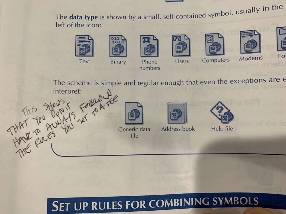
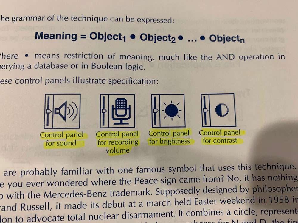
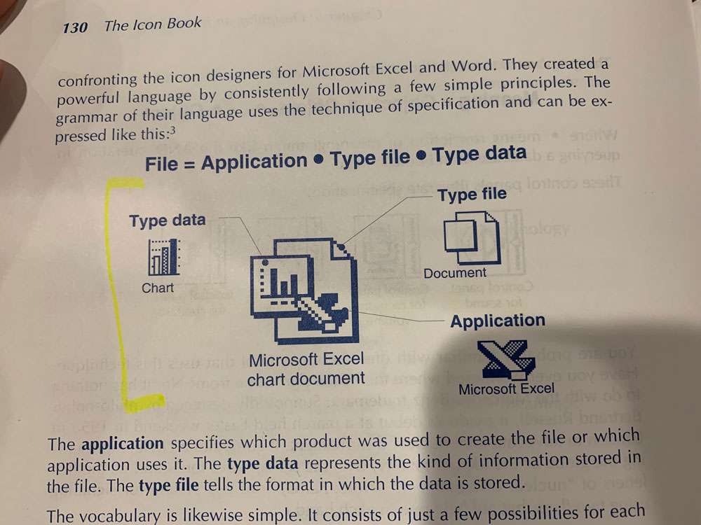
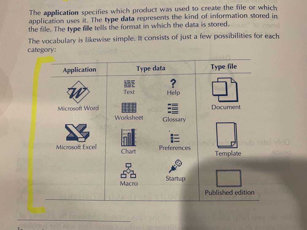
Often an icon must refer to one specific item or category. Specification combines separate images so that each restricts the reference of the others. It is like the practice of stacking up adjectives in front of a noun to sharpen its reference.
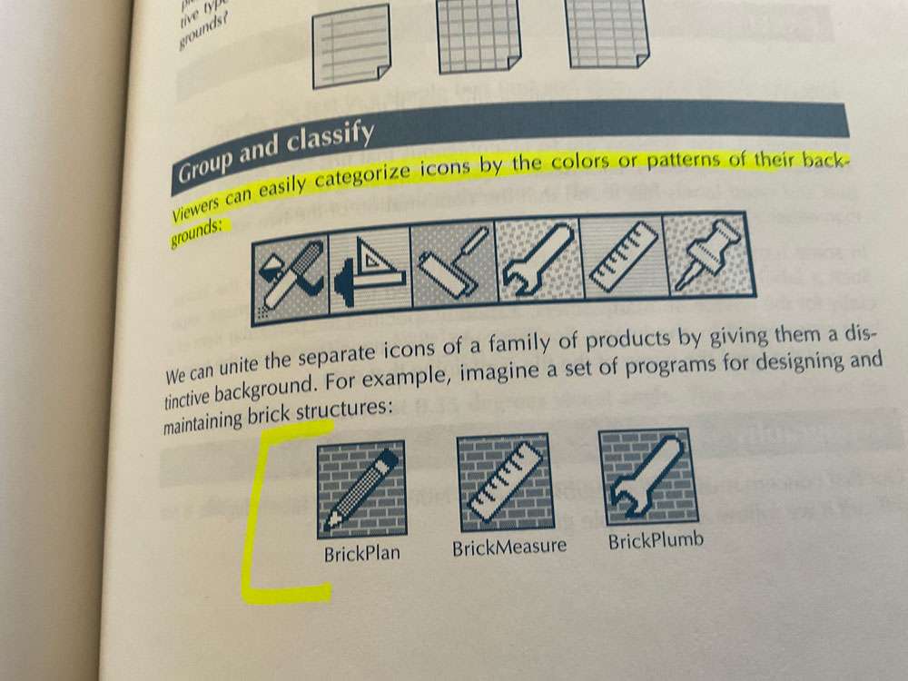
The first step to bringing order to the chaos is to group the icons into meaningful categories and subcategories.
- Involve users from the start. Let users help you pick the categories and subcategories and have them suggest names for the them.
- Group by task. Strive for categories based on tasks the user performs rather than based on the architecture of the software.
- Stay practical. Avoid pedantic or fanatical organizational schemes. If an icon appears to fit in more than one group, duplicate it.
Use a different color or background pattern for different categories of icons.
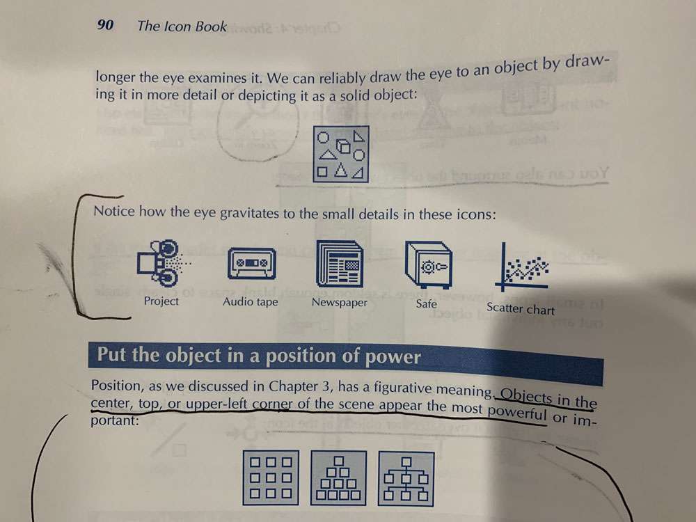
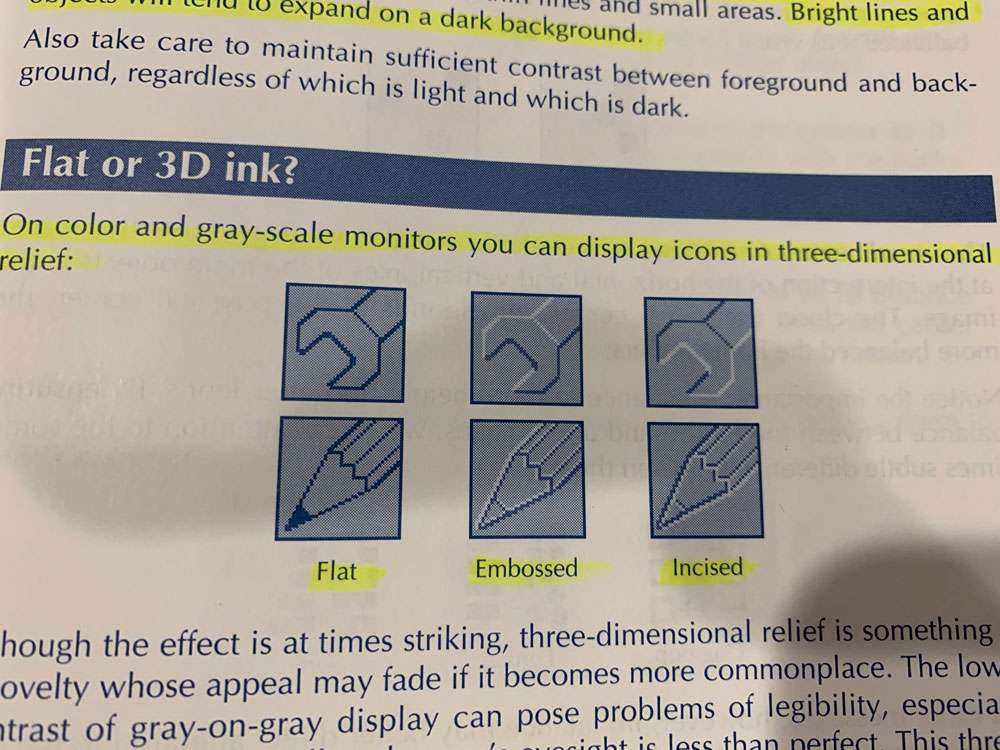
Appropriate details make objects easier to recognize. Our eyes seek out detail in a scene and detail can draw our eye to an image. However, detail can distract and clutter. Excessive detail makes it harder to see a pattern of relationships. Which is best? The rule is simple: Include just those details necessary for the icon to accomplish its purpose. Often a less detailed image makes a better emblem, especially for general or abstract concepts. We can draw icons in five different degrees of detail and realism.
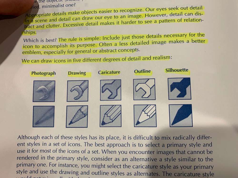
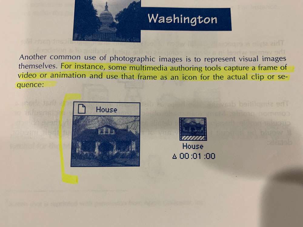
Photographs and photo-realistic drawings can serve as icons. Typically this technique is used for complex objects that require a uniformly high level of detail to make them recognizable. One common use of photographic icons is to represent specific people, buildings, or works of art. For instance, some multimedia authoring tools capture a frame of video or animation and use that frame as an icon for the actual clip or sequence:
Photographic icons are not practical in all circumstances. For photographic icons to work, you need three things:
- Large area. It takes space to represent a complex object realistically.
- Color or gray-scale display. For manmade objects, 16 colors or levels of gray will suffice. For human faces, 256 colors are often required to avoid unsightly banding and blotches in skin tones.
- Familiar object. Unfamiliar objects, even when depicted in detail, are not likely to be recognized at a small size.
Simplified drawing
This style works well for complex objects that require specific details to be recognized. This style is especially useful when objects contain small, significant parts like the vernier wheel in a drafting compass or the spiral binding of a notebook. The simplified drawing style helps us distinguish among objects that share a common profile.
Caricature calls attention to a small, crucial feature of the icon. In caricature we distort a part of the image to emphasize that part.
Outline
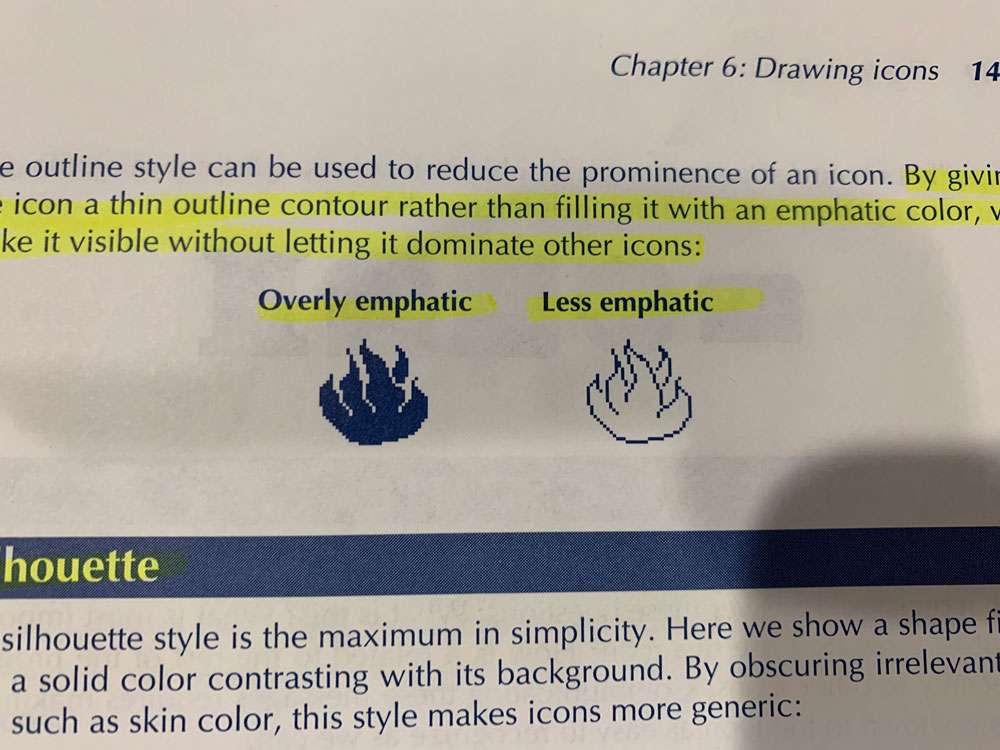
This technique is good for small icons that represent a familiar object having a distinct profile. By omitting internal details and simplifying outline contours, we imply that the icon represents an abstract category or class. The outline style may be the only style practical when the object consists of just edges and lines.
By giving the icon a thin outline contour rather than filling it with an emphatic color, we make it visible without letting it dominate other icons.
The silhouette style results naturally from objects too thin to have a separate outline contour.
Filling a shape gives it a visual mass that makes it stand out from a plain background and from unfilled objects. By combining filled and unfilled shapes, you can control the relative emphasis given to different icons or different objects within an icon.
Each icon should answer these questions: What is this? What is most important about it? How do I use this icon? How is it related to the rest of the program, especially to other icons?
For every object, there is one viewpoint that makes the object most recognizable. This viewpoint is called the characteristic view or the canonical view.
The best view is the one that most clearly reveals the object.
The purpose of an icon is not to tell someone what something looks like, but to remind them of something they already know. For this reason, we often must exaggerate the size of important but small items in an icon.
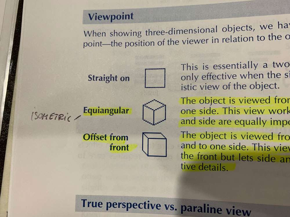
Isometric – The object is viewed from 45 degrees above and to one side. This view works best when the front, top, and side are equally important.
Offset from Front – The object is viewed from the front, slightly above and to one side. This view focuses most attention on the front but lets side and top views reveal distinctive details.
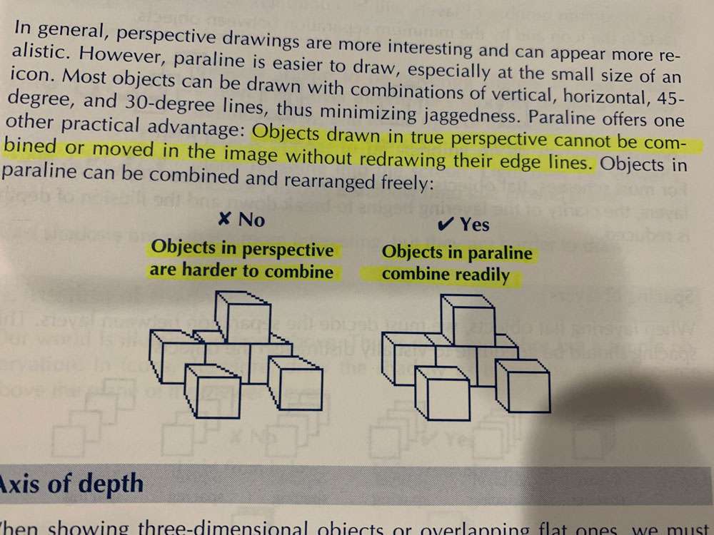
Objects drawn in true perspective cannot be combined or moved in the image without redrawing their edge lines.
Our world is illuminated from above. This is not a metaphor but a simple observation. In icons, therefore, draw the shadow as if cast by a light source above the plane of the viewer’s eyes.
Shadows falling onto shadows or onto foreground objects add complexity beyond what many viewers can handle. If you have objects on different layers, you may want to avoid shadows altogether.
To minimize jaggies, avoid oblique angles, those that are nearly horizontal or nearly vertical. Try to draw diagonals with 45-degree lines. If this is not possible, then use 30- and 60-degree lines.
When drawing small objects, try to avoid arcs or else substitute straight-edged shapes.
As a general rule, make as degree diagonals about one and a half times as thick as verticals and horizontals. The result is that the thickness across the diagonal is the same as across vertical and horizontal lines.
No hard-and-fast rule is possible. If users are accustomed to negative-contrast displays and must consult paper documents frequently, use negative-contrast icons. If their jobs involve tracking small objects, especially those with color codes, try positive-contrast display. Watch out for the blooming effect: the tendency of light to flow from the light pixels into the dark ones. Bright lines and objects will tend to expand on a dark background.
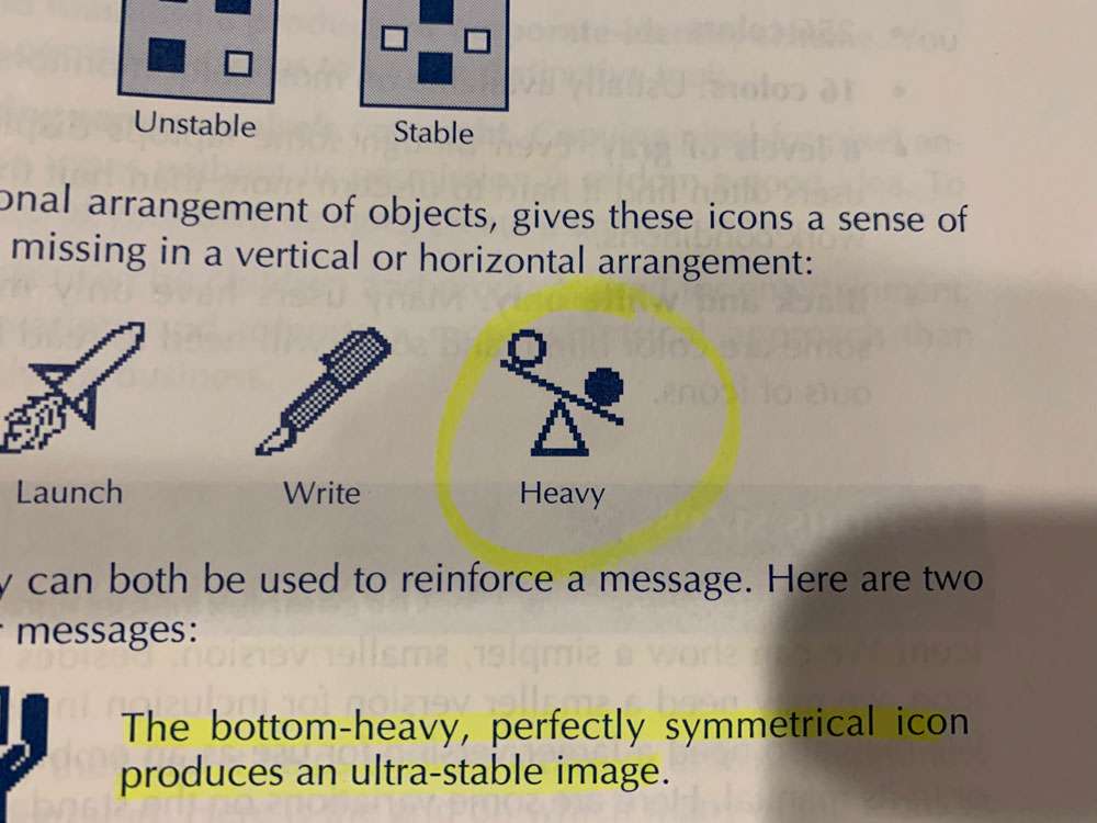
A balanced image appears more formal and static than an unbalanced one.
Imbalance may better direct attention to the critical matter of the icon.

Balance
Visual mass and its effect on balance depend on several factors.
- Number – When more objects are on one side than the other, imbalance occurs.
- Size – Larger objects have more visual mass.
- Prominence – An object that contrasts with the background will have more mass than one that fades into the background. Bright colors have more massthan drab ones.
- Leverage – Objects farther from the center have more leverage than those near the center.
These effects do not operate independently. You can readily combine them to add counterbalancing effects.
Symmetry
- None – The lack of symmetry gives the icon a lively appearance and helps objects maintain their separate identities.
- Vertical – Symmetry about a vertical line strongly links objects. It gives a formal, static balance.
- Point – Symmetry about the center is less formal but still balanced
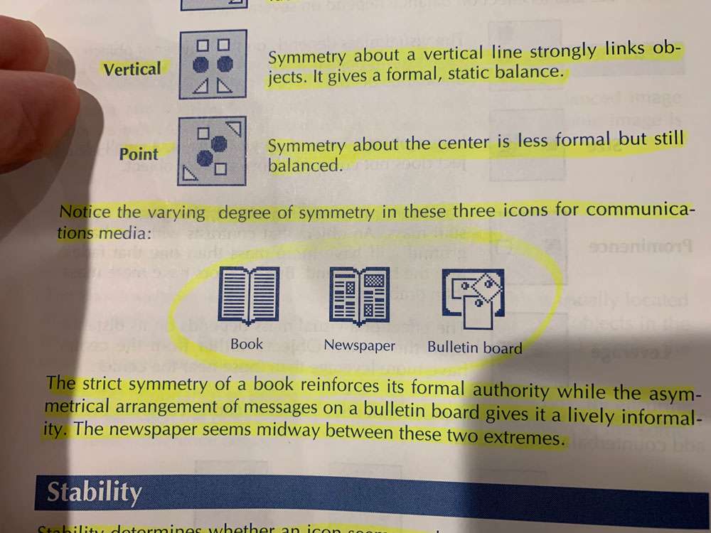
The strict symmetry of a book reinforces its formal authority while the asymmetrical arrangement of messages on a bulletin board gives it a lively informality. The newspaper seems midway between these two extremes.
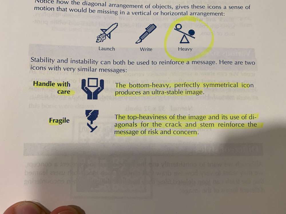
Stability determines whether an icon seems ready to topple over or is likely to stand for years. For a stable icon, lower the center of mass; for an unstable one, raise it. Top-heavy icons appear less stable than bottom-heavy ones.
Even though some laptops display 16 levels of gray, users often find it hard to discern more than half that number in realistic work conditions.
How do we abbreviate an icon? We can show a simpler, smaller version. Besides the main version of an icon, we may need a smaller version for inclusion in lists and on brief menus. We may also need a larger version for use as an emblem on the product’s box or in its manual.
Many icon designers say they find it helps to draw icons, or at least preliminary sketches, on a grid background.
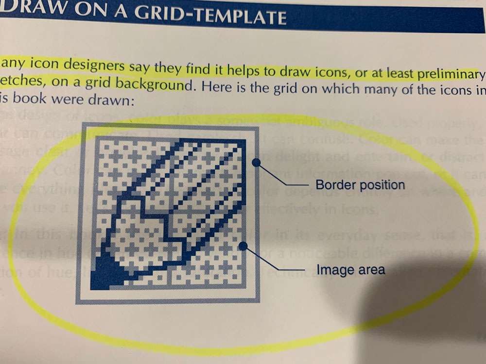
One of the paradoxes of icon design is that design is easier if the grid has an odd number of pixels along each side. This is because an odd number provides a center pixel around which to focus the design.
Color
Decide why you are using color:
- To direct attention
- To speed search
- To aid recognition
- To show organization
- To represent color itself
- To reinforce or arouse an emotion
To make a small item stand out, give it a conspicuous color.
Large areas of pure, saturated color overwhelm and tire users
To deemphasize, hide, or camouflage an object. Fade it into the background. Give it a color close to that of the background.
Color coding can fail if you use too many colors, or if there are too many items in each color.
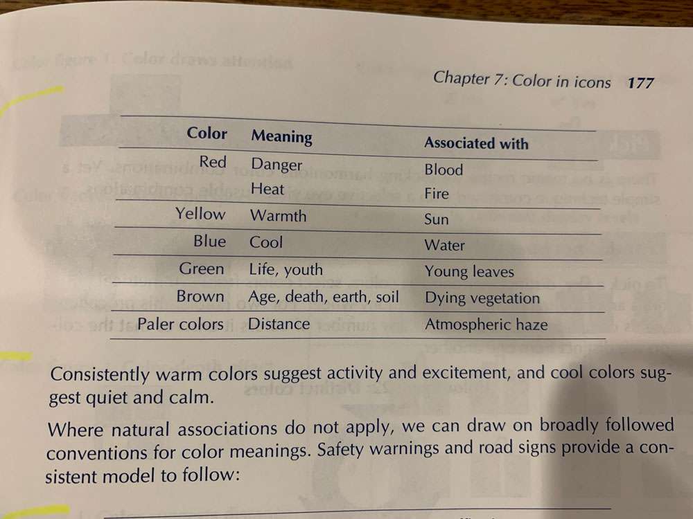
Show the color of the most common, most widely used, and best established version of an object.
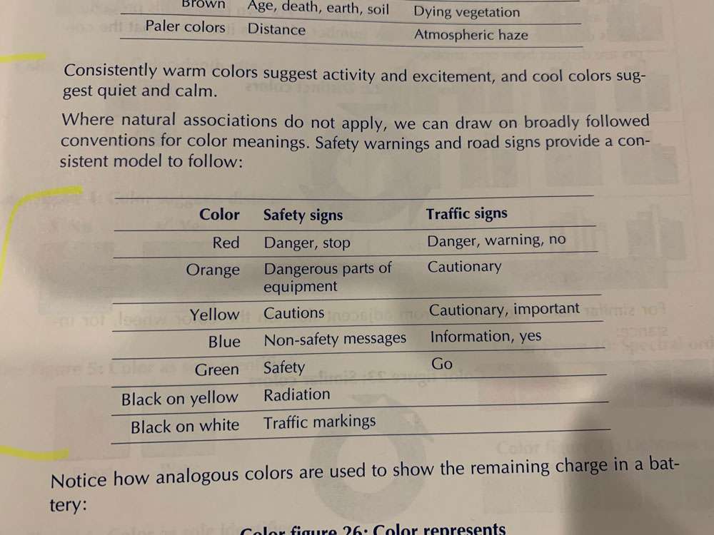
Whenever you use traffic or safety signs in icons, show them in their conventional colors.
We naturally see items of the same color as a group. To show that separate icons are of the same type, class, or category, display them with the same color.
To imply an order or ranking among a group of icons, assign them colors varying in lightness, not just hue. One of the most common mistakes in color coding is to use the color spectrum to imply an order. This scale, which arrange colors as they occur in a rainbow, is not immediately recognized.
Although users can infer the general value from a color, do not rely on color alone to express a value. Color is best used to reinforce a value expressed more precisely by some other means.
The best we can strive for are guidelines for using colors in ways that offend few people and unify rather than disrupt the design.
Staring at a large area of one color for long periods of time dulls the user’s ability to perceive that color. This is a huge case to not overuse color, especially if only using 1 or 2 colors.
Select colors equally spaced around a common color harmony wheel.
You cannot please everyone–at least in your choice of colors. You can, however, avoid offending many.
- Limit use of bright, primary colors unless your program is used by children. Reserve these colors for accenting and highlighting small objects or individual icons.
- Use colors found in nature, they seldom offend
- Select proven colors and combinations. Pick colors that have been popular for many years and in different cultures.
- Avoid trendy, vogue color schemes unless you plan to redesign your icons every year or so.
- Do not overwhelm subtle color icons with bright borders and brilliant backgrounds.
- Avoid juxtaposing spectrally distant colors like red and blue.
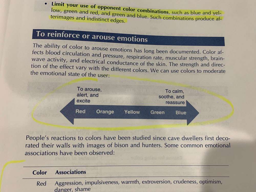
- Limit your use of opponent color combinations, such as blue and yellow, green and red, and green and blue. Such combinations produce afterimages and indistinct edges.

For similar hues, pick colors from adjacent slots on the color wheel, for instance:

Here is an example of the process of selecting colors for an application.
- Decide why you are using colors. Select one primary purpose
- Specify the categories you need to represent. This lets you know how many colors you need
- Select candidate colors
- Make tenative assignments based on common associations of the colors
- Fix specific assignments in the context of the assignment
To avoid disruptive effects of color:
- Use few colors. The more colors you use, the longer the user takes to respond to each and the greater the confusion between colors.
- Use bright, conspicuous colors only for icons that need extra attention.
- Use color only where its meaning is clear to the user.
To overcome the problems caused by color blindness:
- Use color redundantly. Use color only to repeat or reinforce message expressed in black and white.
- Vary lightness contrast. Use color combinations that differ in value, just in hue. Consider a bright yellow, a medium green, and a dark red
- Use just a few colors. Limit how many colors users must distinguish.
- Keep colors to be compared near one another. Locate color legends near the colors they decode.
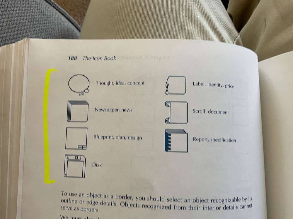
Consistent borders give all the icons a uniform shape and size their individual images may lack.
The uniformity provided by borders robs the icon of a unique outline. The penalty is even greater when scanning for a recognizable shape.
Borders are not limited to rectangular shapes.
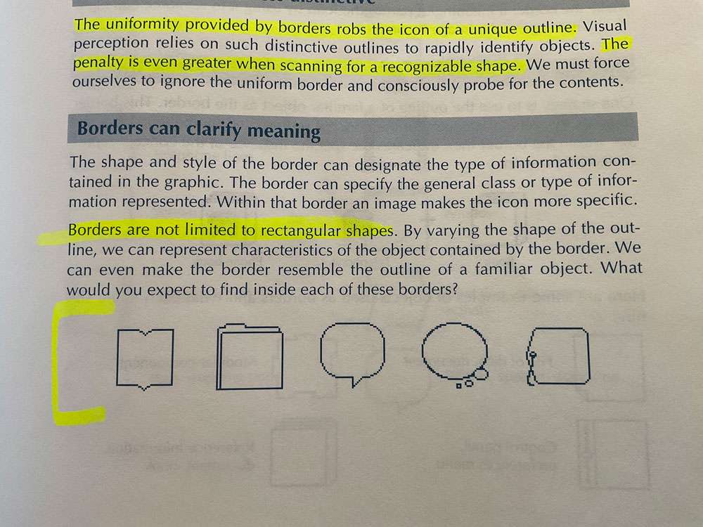
As a visual object, the border competes with its contents for attention.
Make the border a meaningful part of the icon by using it to reinforce and clarify the message of the image it contains.
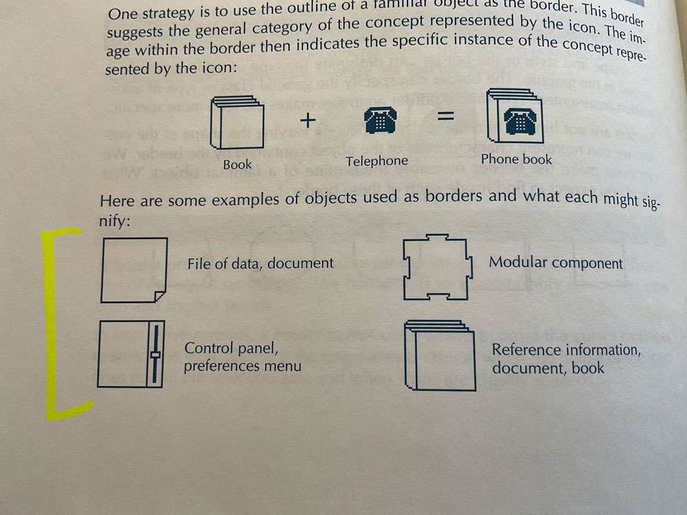
You can also alter the meaning of an icon by making slight changes to the shape of the border. Any deviation from a standard rectangular shape can represent a secondary concept. You can cut one of the corners.
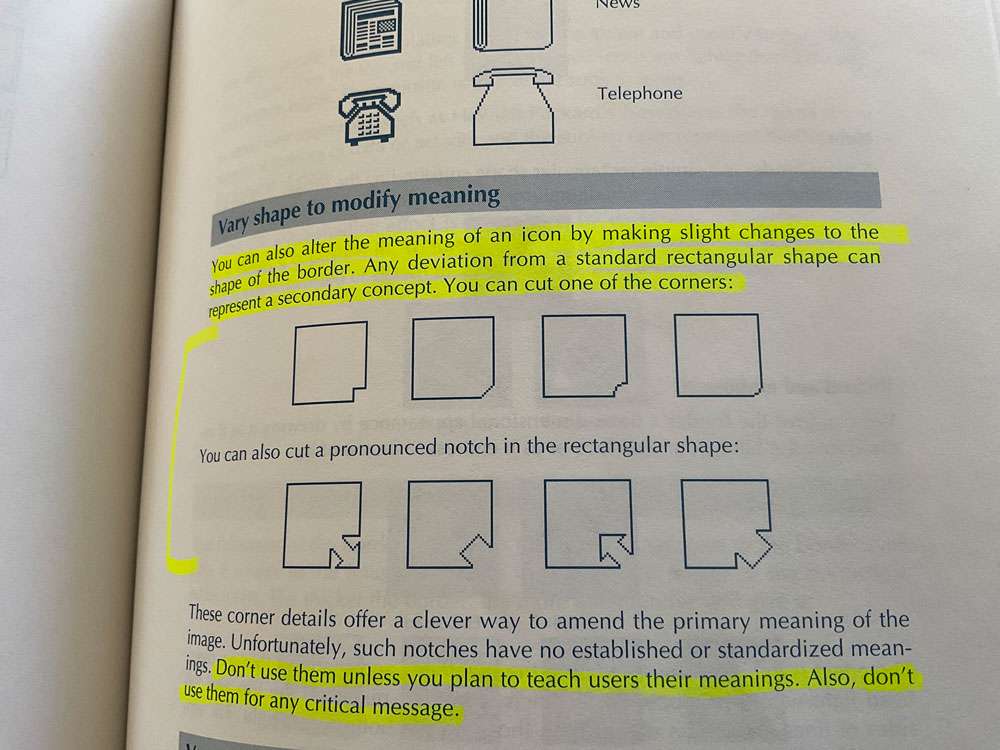
Don’t use them unless you plan to teach users their meanings. Also, don’t use them for any critical message.
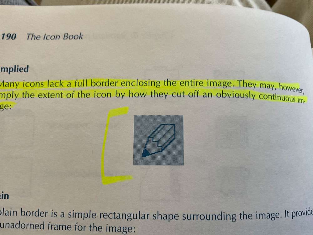
Many icons lack a full border enclosing the entire image. They may, however imply the extent of the icon by how they cut off an obviously continuous image.
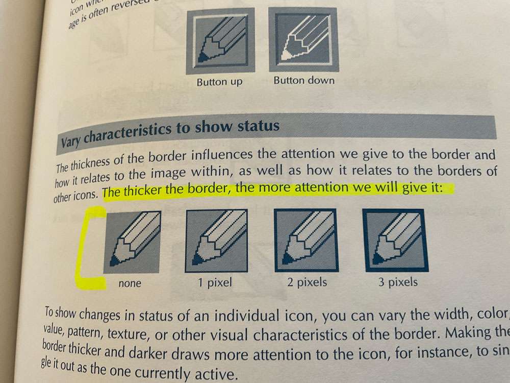
The thicker the border, the more attention you can give it.
Notice how by extending the image to the border we imply a larger object than we can show.
You can enhance the three-dimensionality of an object by letting it protrude over the border of the icon.
Keep the background static. If anything blinks or moves, the viewer perceives it as foreground image.
Viewers can easily categorize icons by the colors or patterns of their backgrounds.
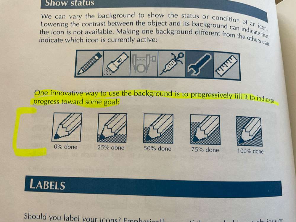
One innovative way to use the background is to progressively fill it to indicate progress toward some goal.
One simple technique is to let users decide whether to display the labels for icons. Typically this is done by setting an option in a preferences menu.
Another approach is to display the label only when the user points to the icon.
To avoid the problem of flickering labels, you can have the system display the label only when the user holds down a special function key while pointing to the icon. This is less convenient than automatic display of labels, and it requires learning the technique.
Puns require such a subtle knowledge of language that they prove difficult for those who read in their second language.
Take special care with symbols that show or refer to text in a way that implies a left-to-right reading direction.
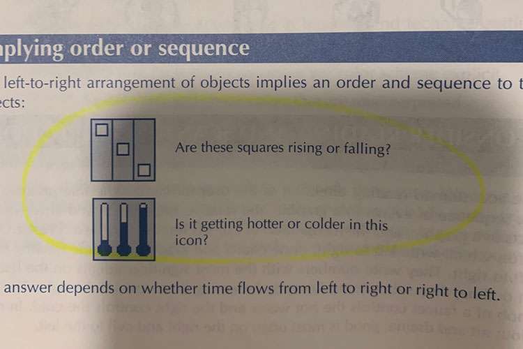
Show sequence with arrows. If you must arrange the sequence of objects left to right, indicate the reading sequence by an arrow:
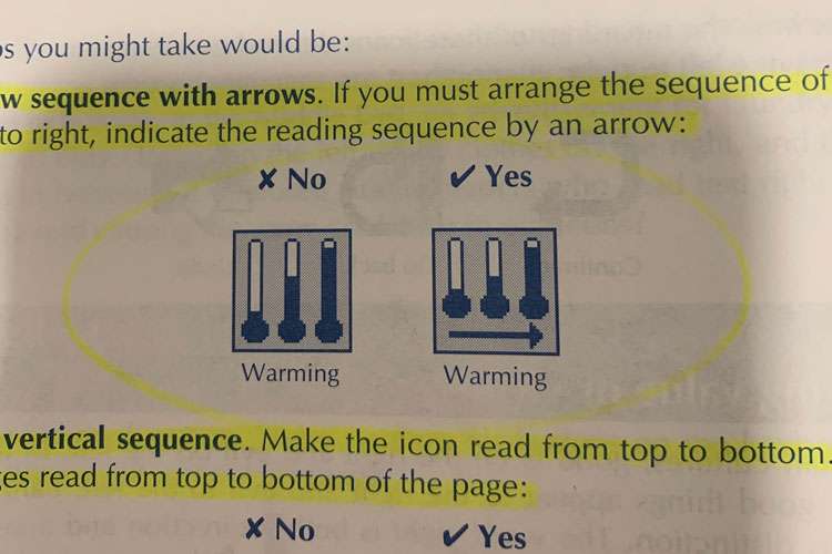
Use vertical sequence. Make the icon read from top to bottom. All languages read from top to bottom of the page.
Mirror-image icons. For the Arabic and Hebrew editions of your applications, flip left-to-right all icons that depend on horizontal arrangement for meaning.
What visual symbols will the user recognize? What symbols have they already learned?
Marketing can tell you why people buy the product and what problem they expect it to solve for them.
Test early and often.
The quality of a visual symbol often depends on the number of times you have revised it. Do not be satisfied with your first idea.
- Think of 5 good ideas for the icon
- Pick the best one and draw it.
- Test and redraw it five times.
All ideas are welcome, even crazy, wild, impractical ones. Often such ideas spark further ideas that are practical. Even obviously wrong ideas can provide a path to better ideas.
Pictionary is ideal for icon designers because it emphasizes the need to communicate clearly and quickly.
Testing
The result of late testing is a tendency to look for only small, easily fixed problems.
In general, 3 phases or types of testing are required:
- Formative – What works? What can we try?
- Comparative – Which alternative is best?
- Evaluative – Is the design good enough?
Formative testing strives to stimulate ideas rather than to refine or verify them. This technique is sometimes called the “two steps forward, one step back” approach. The cumulative effect of the repeated testing and improvement is continual progress toward perfection.
We learn what to do by repeatedly testing a series of prototypes, ever refining them. The basic cycle of formative testing involves four activities:
- Build – Create a prototype, no matter how crude
- Test – See how well the prototype works
- Analyze – Understand how the prototype failed or how it can be improved
- Redesign – Incorporate the lessons learned into the new design
In formative testing, we are not trying to prove that the icon or the product works. We want out design to fail so we can learn how to improve it. In formative testing forgo polished designs and decimal points. Five quick-and-easy tests are better than one scientifically valid one. Remember that in formative testing, we are not perfecting the design, we are trying to come up with a design to perfect later.
Test pairs of subjects, rather than individuals. Their discussions show what they are thinking and reveal their growing knowledge, as well as their misunderstanding.
@joekotlan on X